
I was asked to design a logo for Reismer Sport, a company that holds olympic weightlifting seminars and classes at various gyms and fitness centers.
They specified the font for the logo, and requested that the US and Brazilian national flags be incorporated to reflect the countries of origin for the company founders. Beyond that, any visual nod to weightlifting/barbells was encouraged.

They liked the icon from Opt. 2 and the text treatment from Opt. 1…

They asked for a 3-color version, with black, blue, and a 3rd color. Red seemed the obvious choice…

They wanted to see more of the Brazilian flag, rather than just the stars in the “globe”…

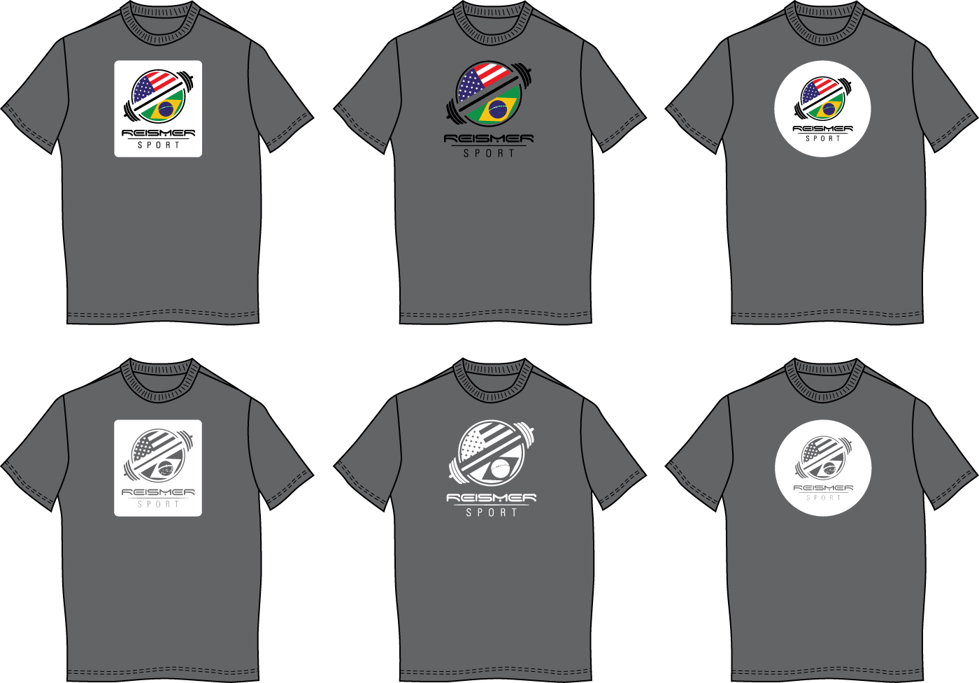
I created a variation on a white circle for screening applications on a dark background. The 1-color white version shows the logo knocked-out of the circle.


I mocked up a few options for screening on a darker t-shirt, both in full color and 1-color.
Related articles
- Reismer’s New Logo! (crossfitkirkwood.typepad.com)
